Designing a poster has many aspects in common with a corporate photography project, or with writing a theatre review – it’s essential to get across something of what the production is about, while at the same time producing an image that’s striking enough to grab the potential audience’s attention. As a photographer once said about his production photographs displayed outside the Royal Court Theatre – “My job is to get their bums off the Sloane Square buses and onto the Royal Court seats …”
A lot of different elements come together to make up a poster – the images, the layout, the text itself and its own arrangement and typeface within the poster layout. Ideally, everything should help to reinforce the poster’s message.

Caryl Churchill’s ‘A Number’ is about a father who has his young son cloned, and unknown to him the doctors produce a number of (obviously) identical boys. Identical genetically, of course, but how much will upbringing and environment alter them?Just two characters, with the younger one playing three of the cloned sons. I took a photograph of the young man, then used a range of colour treatments to suggest different temperaments in the set of cloned individuals. Putting the pictures into a hexagonal grid suggested the honeycomb structure of a bees’ nest, where individuals become workers or queens depending on how they are fed. I tried to do the same with the title, too, using a typeface whose N is identical to Z, so that we read the letter based on its context. Nature versus nurture …A confession – I have a special fondness for this poster as it’s for the first play I directed. With all these examples – just click on the image to see the poster at full size.
*
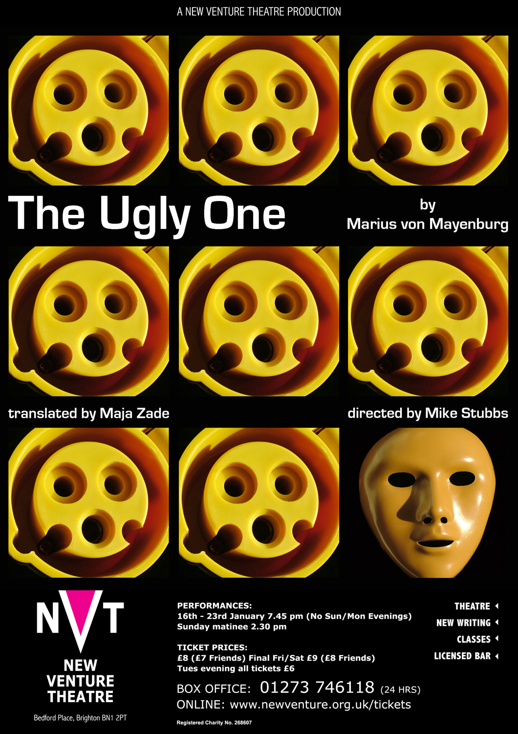
‘The Ugly One’ is another example of a grid of images, and using symbolism to suggest the play’s themes. A play about a man, a very good and kind man, who is so spectacularly ugly that even his wife can’t bear to look at him. He’s an engineer, designing electrical connectors in his job, but his appearance is blocking his career advancement. A plastic surgeon makes him stunningly handsome, after which (of course) he becomes a complete bastard. But the surgeon carries out the same procedure on a host of other men, and finally the (ex) Ugly One is surrounded by lookalikes, and no longer special or highly regarded. I wanted the poster to feature electrical components, but also to be about the duplication of a face. I had to search a bit to find a suitable yellow cable connector.
*
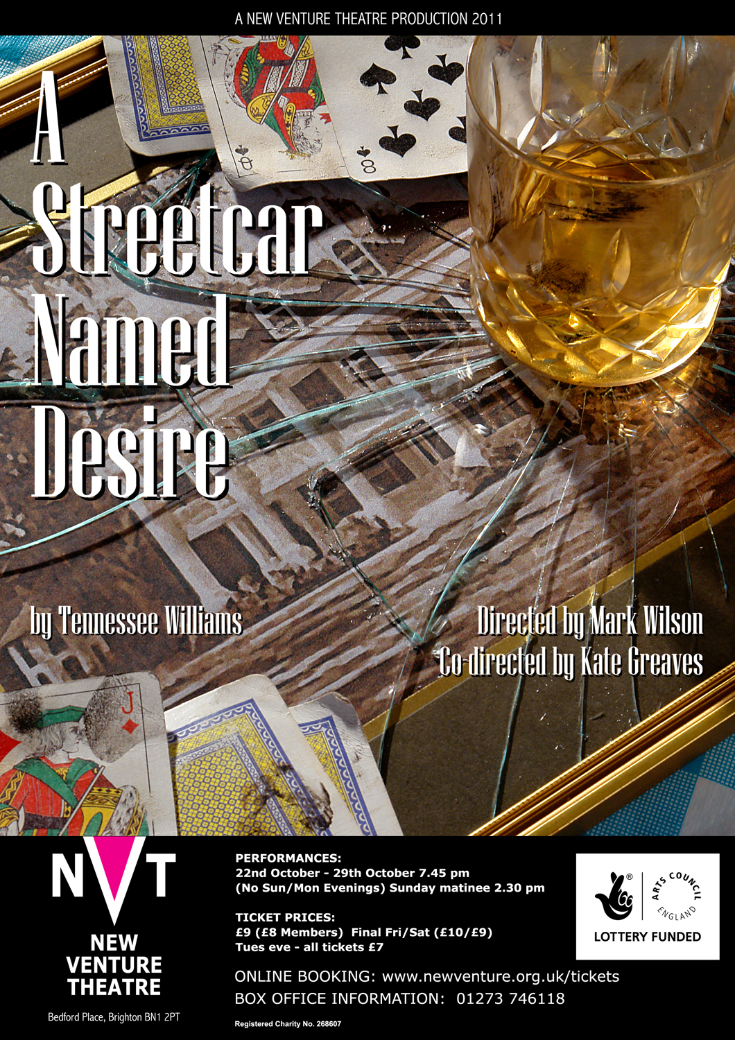
As a photographer, a lot of my posters use a photograph as the starting point (and I make no apology for that …). For ‘Streetcar’, I wanted to capture the macho violence of Stanley Kowalski’s life, and how it destroys Blanche’s memories of the antebellum Southern mansion where she grew up. Smashing the glass was tricky, but not as much as getting the fracture lines to show up. The whiskey was real, and got drunk several times before I was happy with the shot … I was careful to include a Jack and a Queen in the poker cards.
*
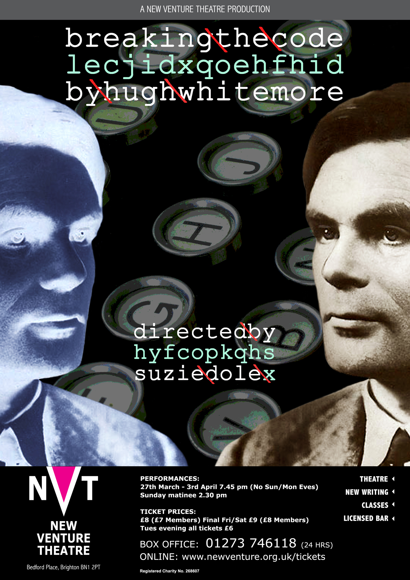
‘Breaking the Code’ couldn’t be more different. Alan Turing was a mathematician whose wartime work helped build the first computers. These were used to decode the messages encrypted by the German military using the ‘Enigma’ machine. ‘Enigma’ turned clear text into gibberish, and back again for the recipient. I was intrigued that the play’s title had the same number of letters as the author’s name, so I used that in the poster’s wording. Turing himself was homosexual, illegal in the forties, with a secret life (he committed suicide after being convicted of the offence). Earlier last century gays were defined as ‘inverts’, so I’ve shown Turing both positive and in negative – (or clear and encrypted …)
*

Martin McDonagh’s black comedy features (appropriately) a black cat, who belongs to a madly sadistic Irish Nationalist fighter. He (the fighter) is being targeted by gunmen from a rival terrorist group, and they try to lure him into a trap by – supposedly – shooting the cat. So this was the obvious image to use. Obvious, but not easy – I had to take almost a hundred photographs of Beau before I got the one I needed. The guns were photoshopped in later. Phew! …
*

More weaponry in ‘Not Talking’. This one’s about young Army cadets on a training base. Male and female soldiers, and one of the young women gets raped at a drunken party. The military ethos demands that she doesn’t talk about the assault – so she doesn’t. She clams up completely, and spends her days playing Bach on a piano she discovers abandoned in a corridor. I wanted to symbolise the soldiers, with one of the group damaged; and also include the piano. I liked the contradictions of the ivory piano keys and their juxtaposition with the brass bullets.
*

Here’s another weird juxtaposition. ‘Beginning’ might (just) be the beginning of a relationship, in the aftermath of a fairly drunken party. He’s forty-two, divorced with a seven-year-old he hasn’t seen in four years (that’s her on his phone, taken when she was three). She’s thirty-nine, doing well in her career – the party was to celebrate her new flat – but she’s running out of time to have a child herself. She’s had sexual encounters, obviously, and she always carries a condom in her bag. Now she thinks that this man might be good actual father material, so at the end of the play they decide to go to bed. They’ll use her condom the first time – and if it goes well, maybe in the morning they’ll do it again – without …
*

And another one featuring a condom. ‘Oxford Road’ is a play about the town of Reading (which has an Oxford Road as part of its low-life area). It’s about dissolute lifestyles featuring a load of cocaine, and booze, and sex with prostitutes. I’d noticed the bottle label, and found a way to make the play’s title incorporate the anger of the central character’s sex-worker girlfriend. Like the ‘Beginning’ poster above, I included an overturned wineglass, but I was keen to show light in the spilled wine in this one. I like it, but the play’s director finally wanted a boring collage of the characters’ faces. Tough. Time to open another bottle …
*

… or take a glass of brandy. I produced this one for a production based on ‘The Pickwick Papers’. The director wanted the warmth of Dickensian London, and I tried to give a feeling of Pickwick the gentleman and Sam Weller, his servant. Their relationship has always reminded me of Don Quixote and Sancho Panza, so I was careful to include a nod to Cervantes’ book. But once again, the director (you’ve guessed it) wanted a picture of the two actors.
So this is the one that finally got used. I have to (reluctantly) admit that I’m very pleased with the result. It’s the first time I’ve used an AI rendered image as a background.

*

There’s sex in ‘The York Realist’. A Yorkshire farmer (that’s him on the right) takes part in a community production of the York Mystery Plays, and has a relationship with the Assistant Director, up from London. I originally photographed the two actors for a press release, but then we decided that it conveyed the essence of the men’s connection beautifully. Tamsin sourced a sky, from her own picture archive, and we cut the two together to produce something that hopefully conveys the warmth of Peter Gill’s writing.
*

Sometimes a direct head-shot gets the message across clearest. Steven’s a nasty bit of work – a press officer for an American presidential hopeful in an early primary election. He’ll stop at nothing to get what he wants (as the quote shows) and the production’s director (another Steven – O’Shea this time) wanted to emphasise that it’s all about the man’s personality. I liked the hardness of the imagery in this one.
*

Here’s another with just part of a face. Right up close. ‘Mademoiselle Y’ is about two women in a bistro in Belle Epoque Paris. It’s an adaptation of ‘The Stronger’ by August Strindberg. They appear to be friends having a conversation – though one of the women never speaks. From the one-sided exchange, it gradually becomes clear – to us and to the woman herself – that the silent one is the mistress of the other woman’s husband.
*
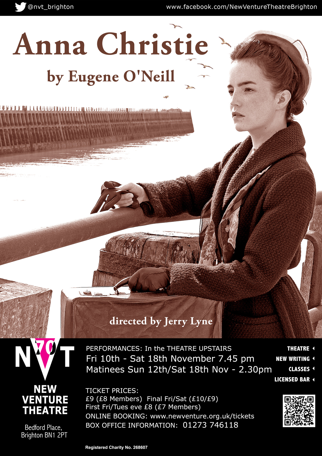
Or maybe not quite a direct headshot. Anna Christie goes to Boston to meet her sailor father, who she hasn’t seen in fifteen years, and the play’s action takes place in a dockside bar and on a coal barge. So we wanted to illustrate the character in an appropriate location, and make the photograph look decades old. I’ve sailed into Newhaven harbour many times so I knew the breakwater – and where to position the actress. All it needed then was for Tamsin to Photoshop in some gulls.
*
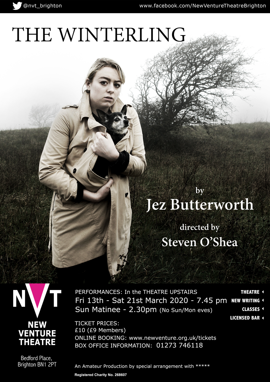
‘The Winterling’ also needed a character in an appropriate location – in this case the wilds of Dartmoor in wintertime. So no problem there, then . . . Some gangsters are hiding out in an abandoned farmhouse on the moor, and a young girl has arrived there the previous year, along with a dog. A winterling is something that you’ve had over one winter, so the director wanted them both on the poster. I found the blasted tree not too far from my home, and bleached a lot of the colour out of the photo to make it look chilly. Brrrrr!
*

Rather warmer environment for ‘Picnic at Hanging Rock’ The play s about a group of Australian schoolgirls who go on a school outing to the eponymous Rocks – and some of them go missing. Tamsin developed the concept, and I shot this in the studio, hopefully producing the sense of an abandoned meal, beginning to be infested by ants.
*
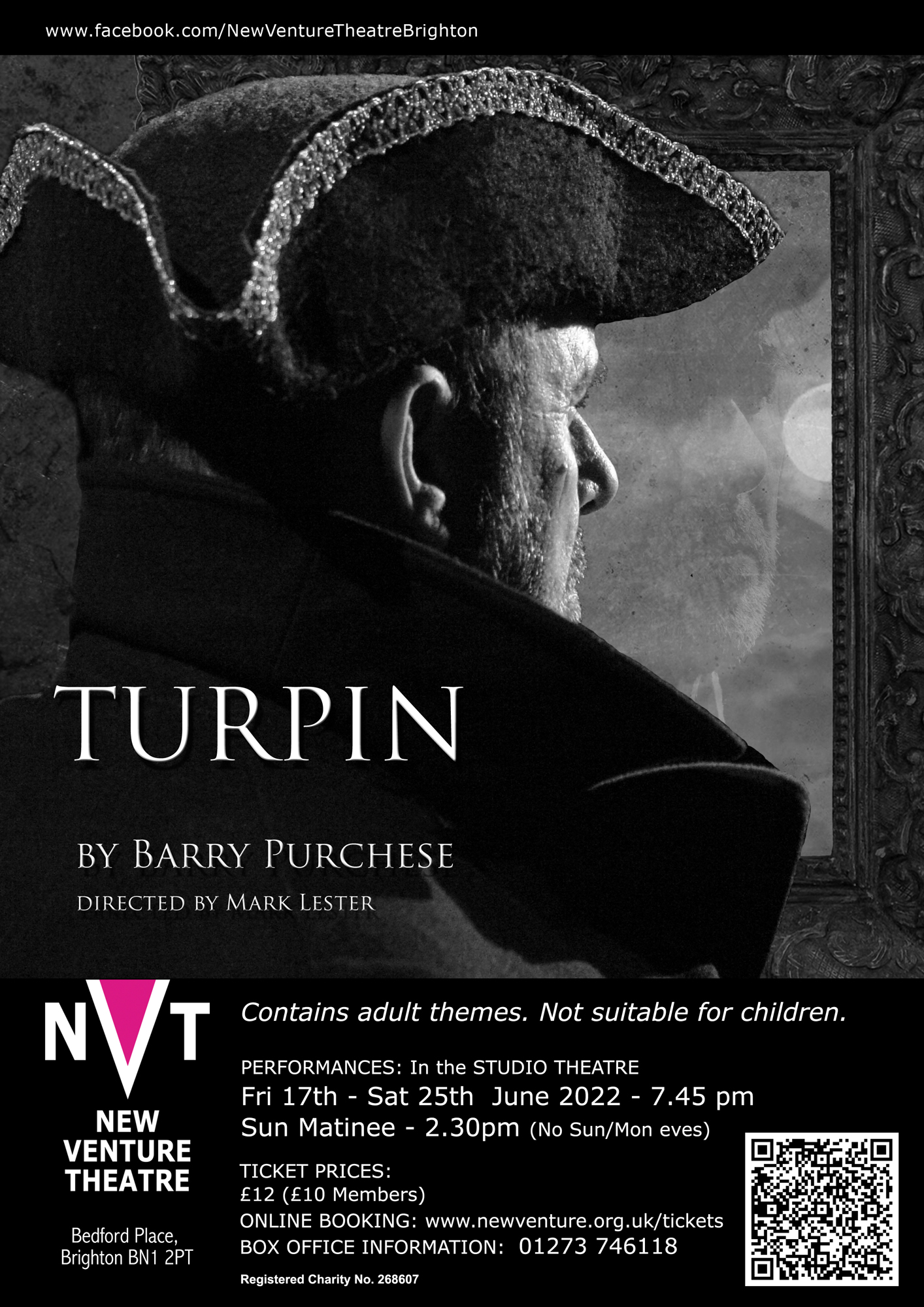
The treatment of Dick Turpin couldn’t be more different. Turpin was a highwayman, a criminal, but Barry Purchese’s script brought out the man’s humour as well as his insecurities. Tamsin knew what she wanted in the design – including the reflection – so all I had to do was light the actor to make the concept work. We decided that the image was much stronger in monochrome.
*

Another one of Tamsin’s creative designs. Martin McDonagh’s play takes place in a pub, so we took the photo on site at a friendly bar not far from where we live. They were really helpful, and I was able to use my lights to get enough illumination onto the bowler hat to show up the texture on the felt. Tamsin mocked up the pump label to give the play’s title – though actually it wouldn’t be a bad name for a beer …
*
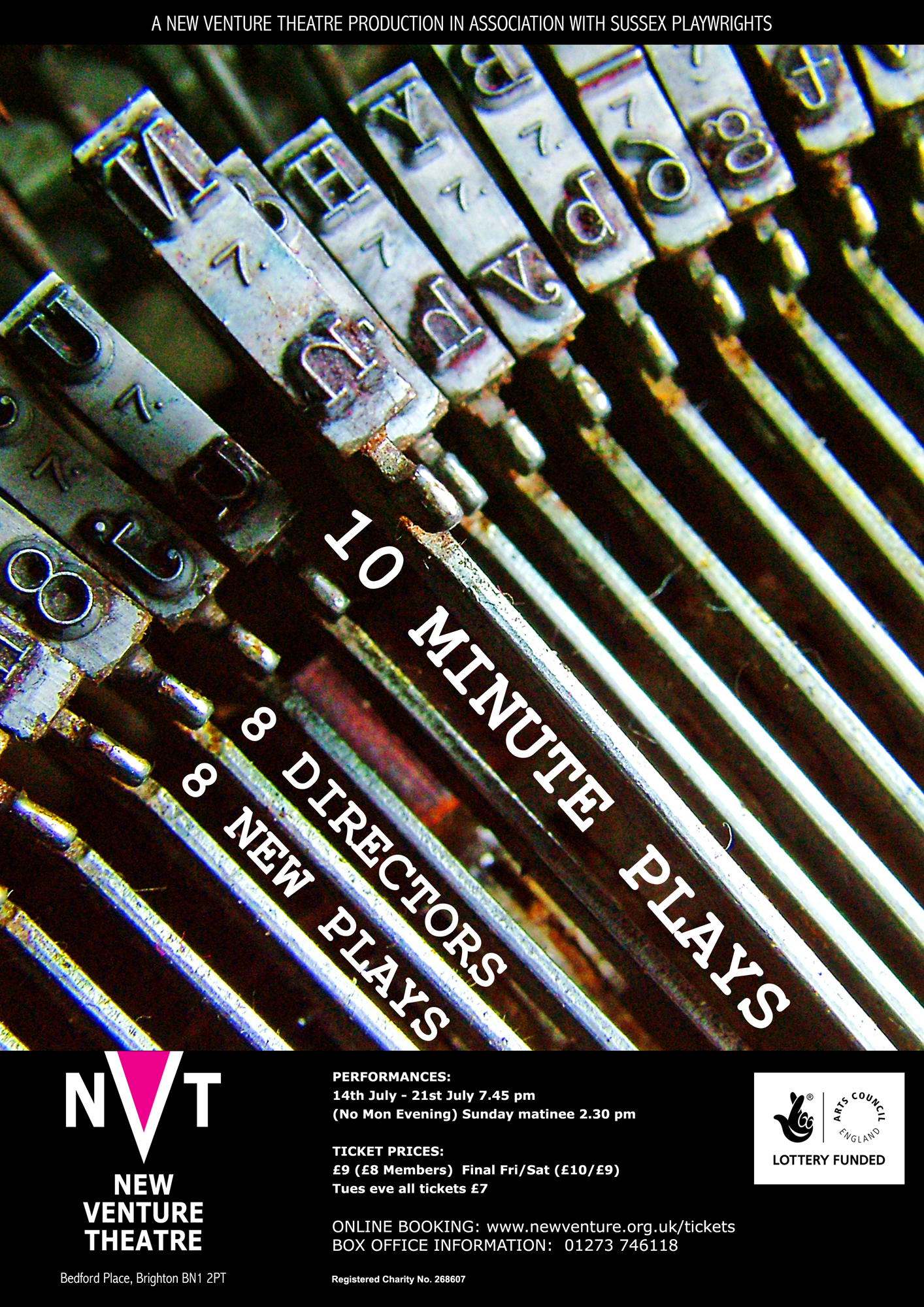
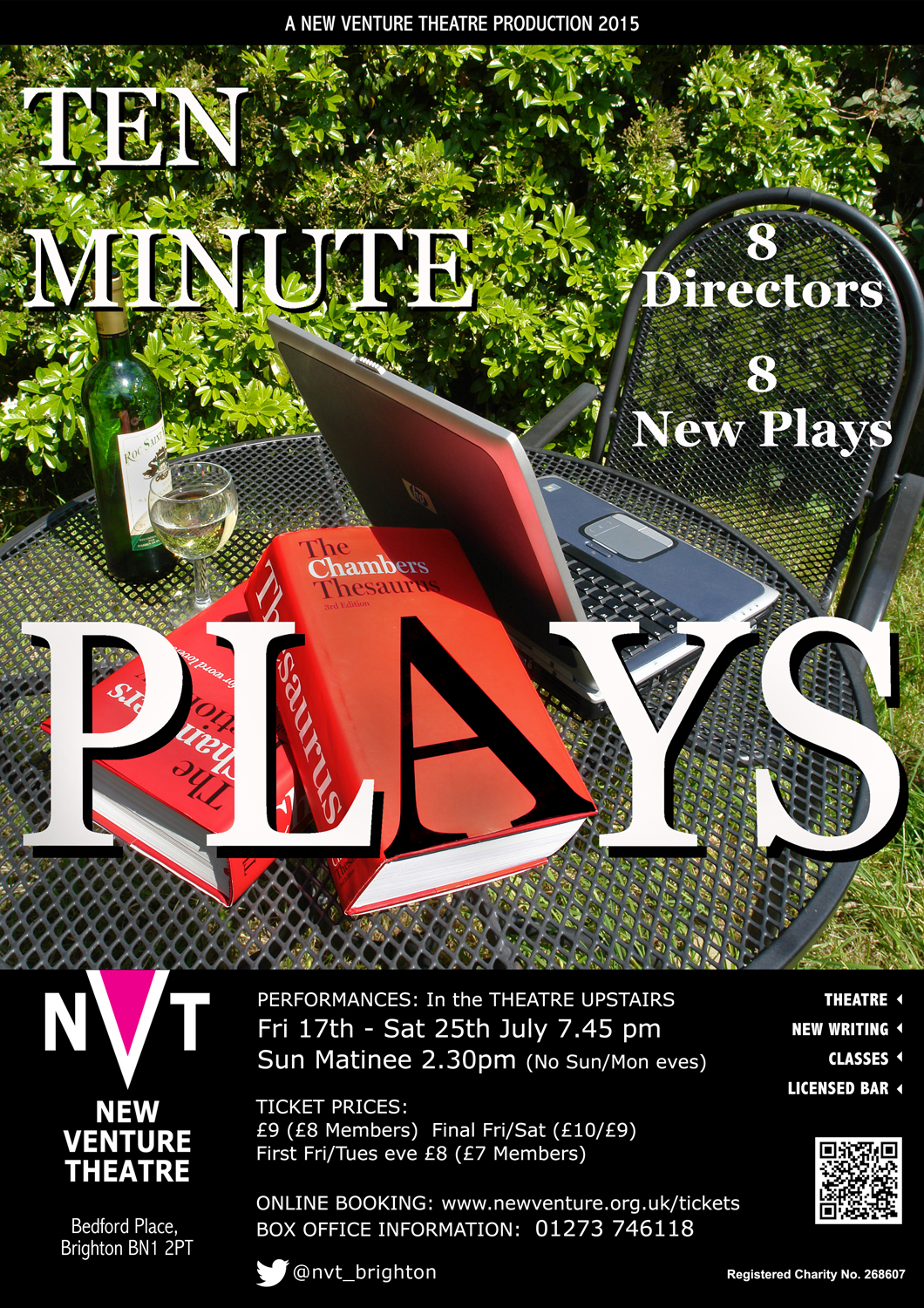
This one could really only be done using photography – nothing else would have got the close-up detail in the typewriter typebars. The poster for NVT’s ’10 Minute Plays’ competition had to portray the concept of ‘writing’, as it’s an evening of newly-written plays … though I wonder how many of the authors actually used a real typewriter? The design also allowed me to be bolder with the text alignment. Luck plays a part, as in so many projects – I wanted to feature on the ‘N’ typebar (as in New Venture) and only realised later that I’d managed to include the 8 as well.
*

Another year, another competition, and so another poster. This time I went for the ‘ten minute’ aspect. Still chasing that 8 – VIII in this version, of course – and so the whole thing became rather Gothic …
*
And again … I went for the text option for this year’s competition. Words words words. And the wine helped too, naturally!
*
In 2025 we had a programme of five short plays at NVT. Completely different themes in each, so I decided to focus on the theatre lanterns as a background image to the text.
*
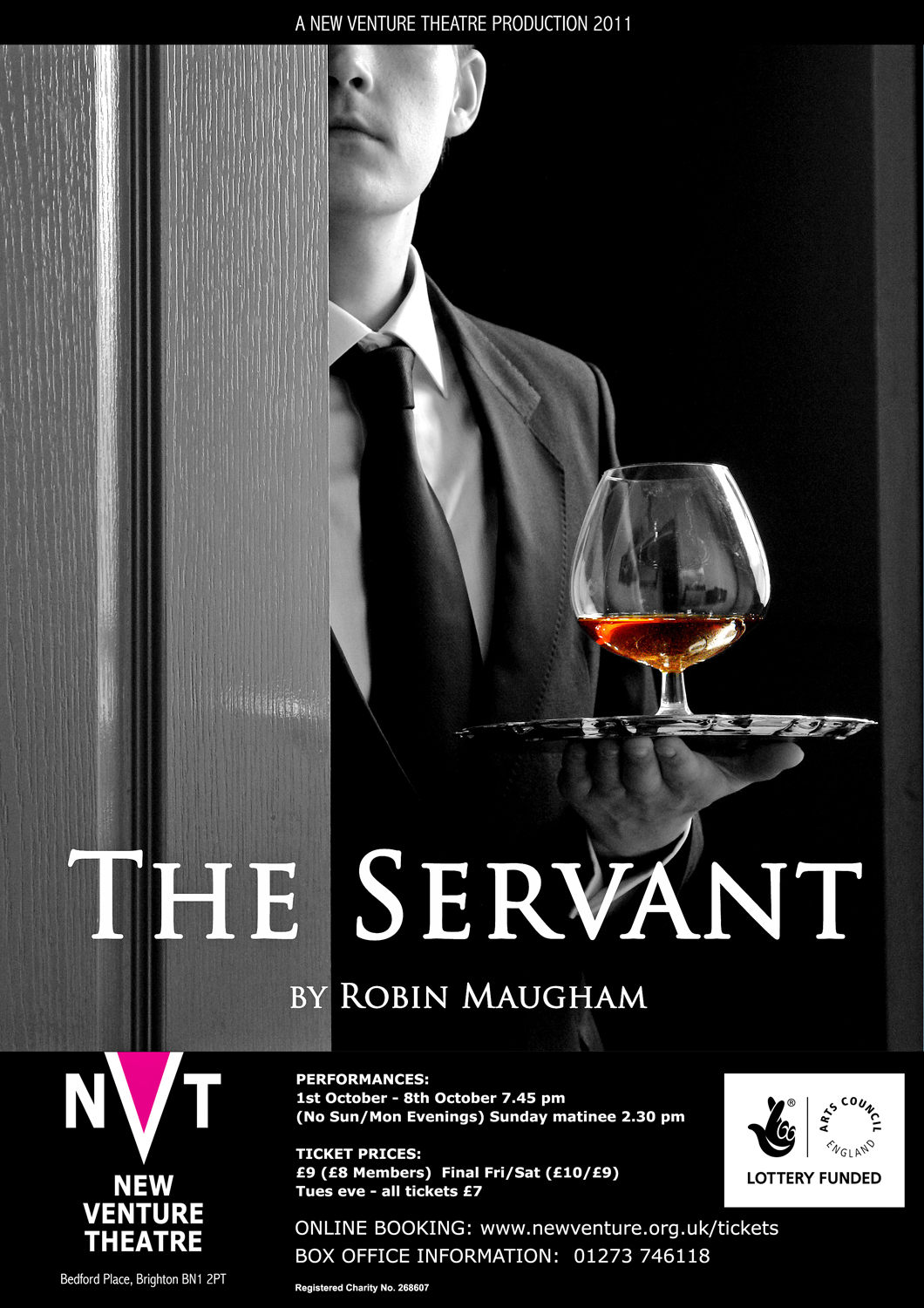
‘The Servant’ is a slightly clunky play that was also done as a great sixties’ black and white film. It’s about a rich man who returns from Africa to London and whose friends find him a house and a manservant to look after him. A psychological study of dependence, as the manservant feeds his addiction to alcohol – and working-class women – and gradually comes to be the dominant personality. The photograph is in B/W as I wanted to keep some of the sixties style and contrast, while pulling the viewers’ attention to the brandy – the one spot of colour in the whole image. Not showing the eyes seems to make the figure seem more sinister, and hopefully quite disturbing.
*
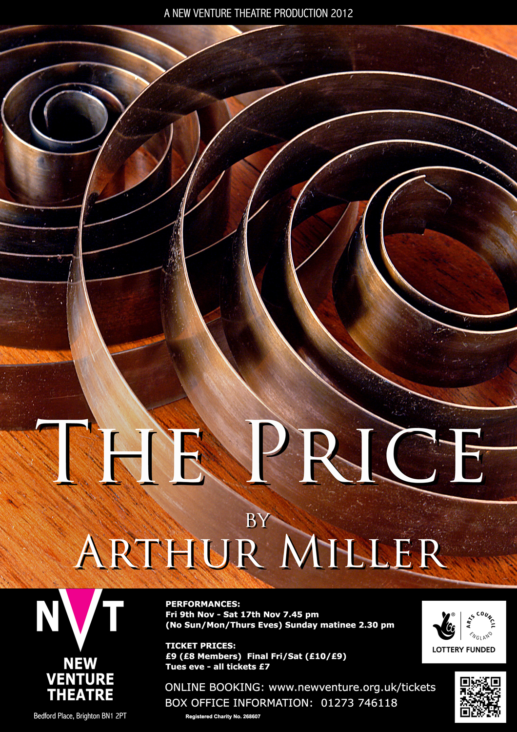
‘The Price’ is a play about two brothers who argue about their dead father’s possessions, for which they want to get ‘a fair price’ when they sell them. Being Miller, the play is really about unresolved family tensions between the two ageing men. The action takes place in New York, in the attic of the family home, surrounded by long-forgotten objects. I saw the clock springs in a local horological shop, and they seemed to sum up the tensions between the two brothers, as well as the broken-down state of many of their late father’s things.
*

‘Festen’ is another family drama, Danish this time, about the celebration (Festen is the word in Danish) of the 60th birthday of the head of a large and bourgeois family. At the dinner, the eldest son publicly accuses his father of sexually abusing both him and his twin sister (who has recently committed suicide) while they were children. The family initially rallies round the father to support him, but the presence of a young granddaughter forces them to face up to what has actually occurred. I wanted to show the child, confronted with disturbing events that she cannot understand, and also give a sense of the shattering of comfortable social conventions.
*
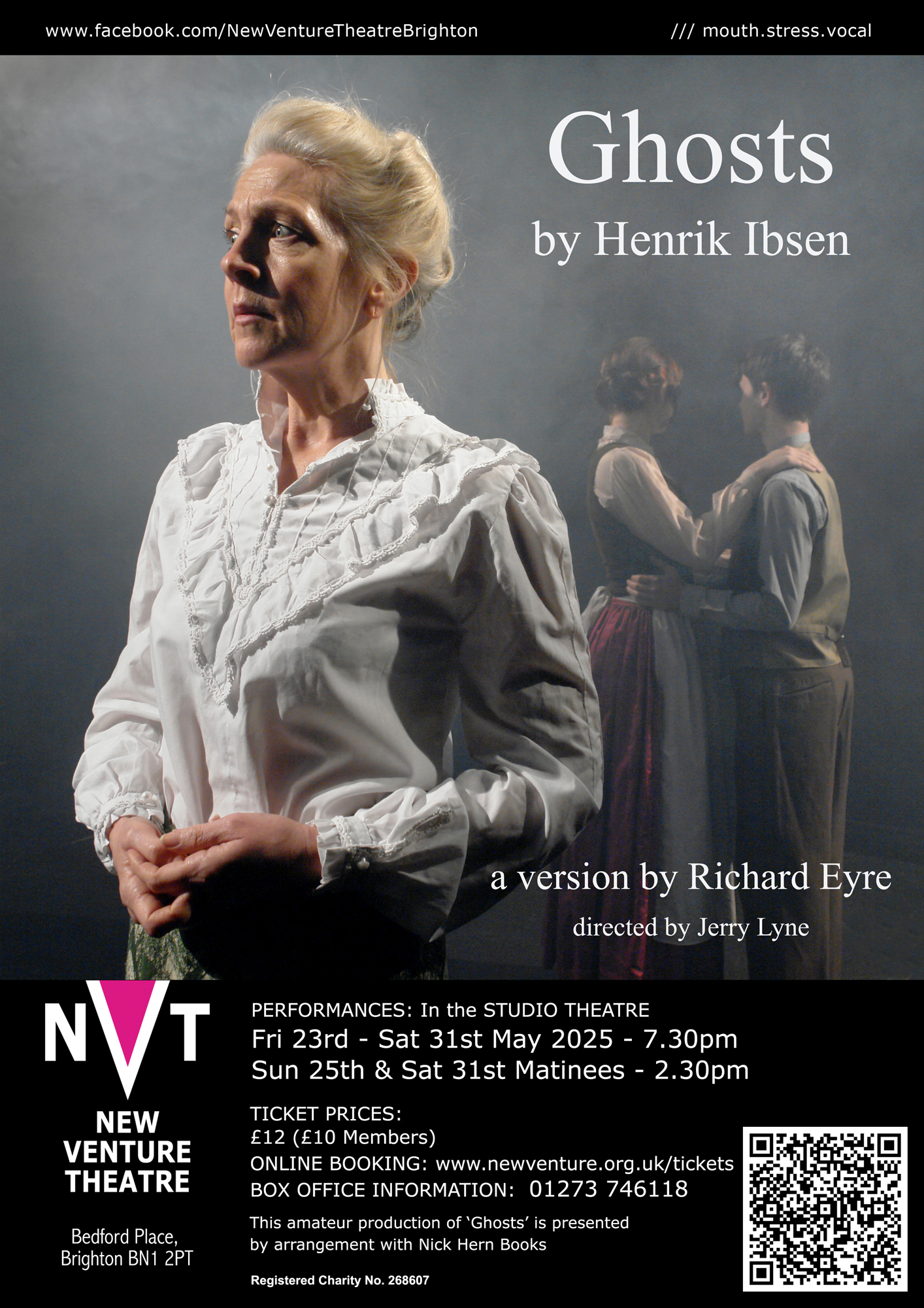
‘Ghosts’ is yet another Danish play; Ibsen this time. Another tale of dissolute fathers, and how the repercussions echo down the generations. We needed to show the mother, with the figures of her son and his half-sister as cloudy images in her mind. (the shoot used so much smoke we set off the theatre fire alarms …)
*

Posters need a strong image which conveys as much of the production’s themes as possible. Neil LaBute’s play ‘Reasons To Be Pretty’ is about people who have very few qualifications or prospects, and so fall back on their appearance. When a character’s ‘beauty’ is questioned, she gets incredibly angry, even threatening to kill her boyfriend’s fish. I wanted to use lipstick – something normally used to enhance beauty – as the medium for expressing extreme anger. I couldn’t get the director to use it, though, and he went with his own design. I was gutted – though not as much as the fish . . .
*

‘Connection unsecure: continue?’ is a two-handed play about life online, and how we deal with virtual relationships – often at the expense of real ones. The two characters spend most of their time communicating via their computers, and I wanted to give the sense of them as digital entities rather than flesh-and-blood beings. Once you go digital, of course, you can combine images in completely new ways …
*

‘Biloxi Blues’ tells the story of six young GIs at a basic training camp in Biloxi, Mississippi, in 1943. They’re taught how to shoot and march, of course, but they also learn from each other about friendship, trust, race and class … and sex. Two important women characters feature in the boys’ development, and I wanted them to feature in the poster too. A rifle bullet has the same overall shape as a lipstick, and I wanted to explore the phallic subtext of both objects. Plus – I love photographing metallic objects, the results repay the effort needed.
*
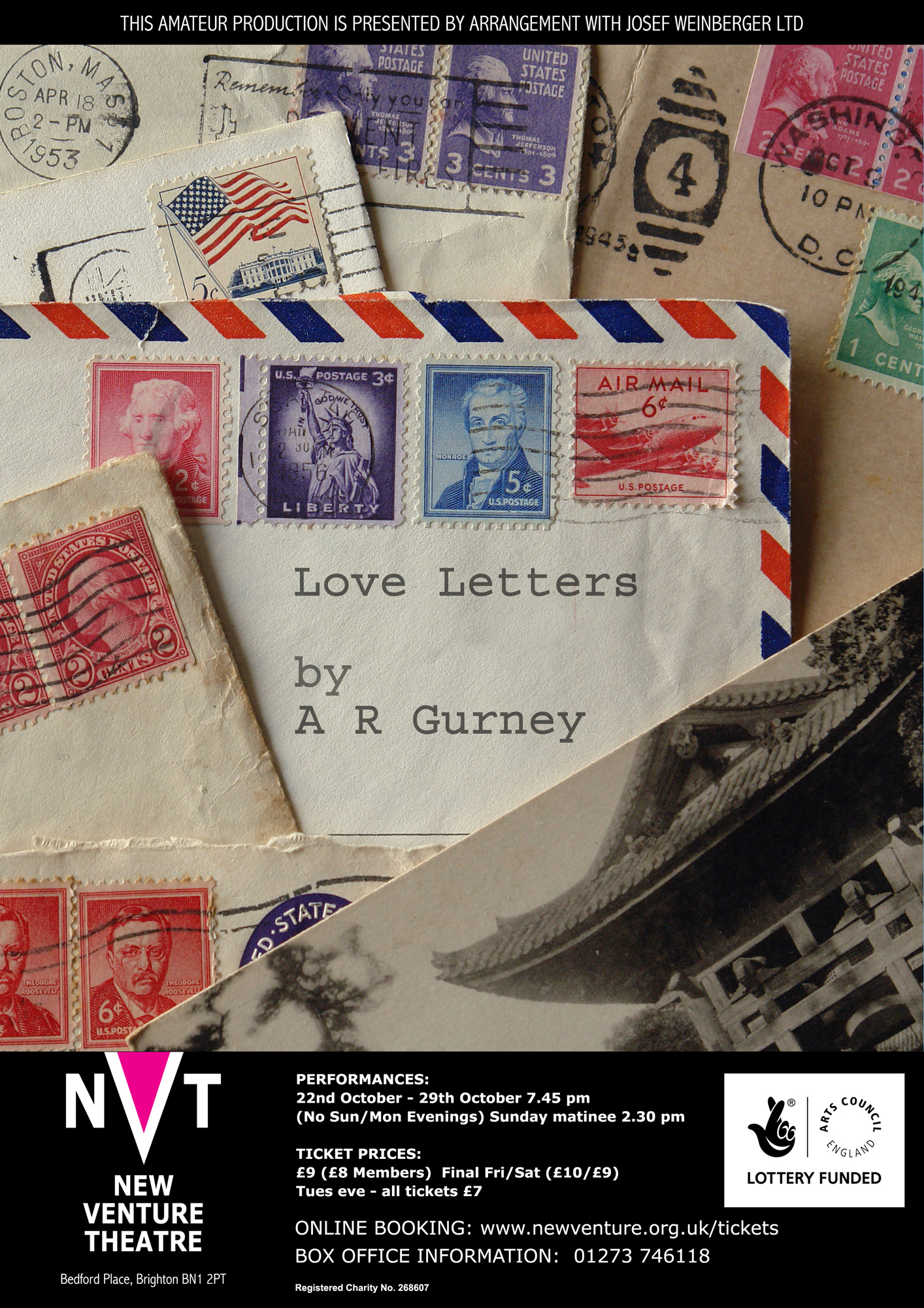
‘Love Letters’ is a piece written by A R Gurney in 1988, and consists of letters and cards sent between two upper-class Americans over a period of fifty years. They are meant to be read out by two actors seated at a table, like a rehearsed reading. It’s popular with actors or celebrities, as they can fit it into a busy schedule without a rehearsal period. When I came to direct the piece, I chose to do it with Andy (in the present, after Melissa’s funeral) reading his past letters to Melissa, and her replies being read by the actress seated at rear, under dimmer light, so that it was unclear whether she was Andy’s memory, or a ghost. I found the American envelopes and postcard in a Brighton curio shop, and used Courier as a (typewritten) typeface for the title.
*

What to say about ‘Dinner’? Only that it’s the dinner party from hell, with spouses, lovers (current and ex), lobsters (cooked and VERY live), violence – and a suicide … I sourced the lobsters at Riddle & Finn in The Lanes in Brighton, and photographed them there. A great fish restaurant.
*
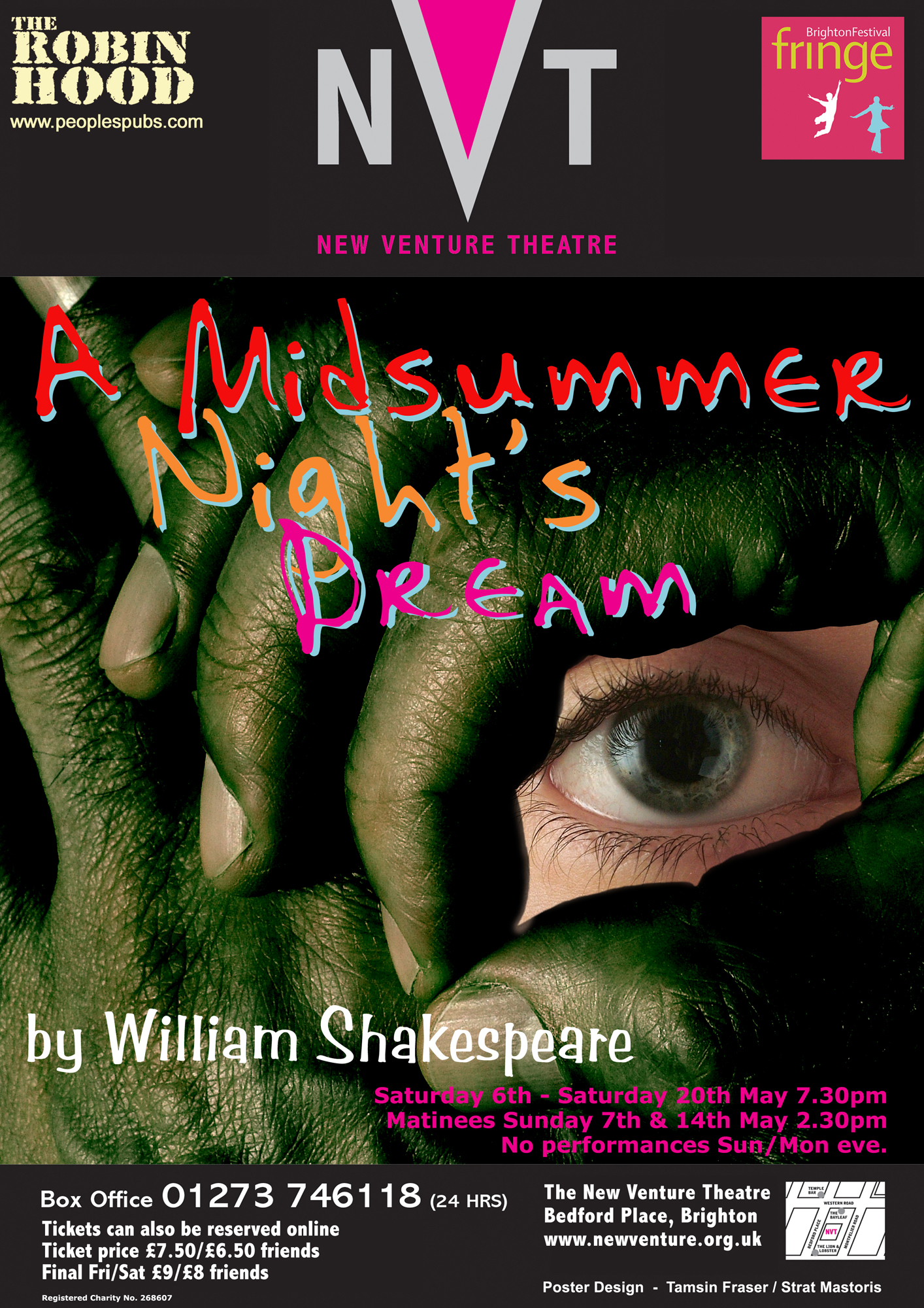
A different kind of celebration here – ‘A Midsummer Night’s Dream’ has the Rude Mechanicals performing the play of Pyramus and Thisbe for the court of King Theseus. At one point the lovers glimpse each other through a chink in the Wall (another player, Wall, holds his hands to form a small aperture). I wanted to get the effect of someone peering through a small chink, formed by meaty, dirt-stained tradesman’s hands, referencing that scene from the play, but also engaging directly with the viewer of the poster.
*

Plenty of violence in Richard III The director wanted to set the play in the current era, and bring in references to imprisonment without trial at Guantanamo Bay. I had a photograph I took years ago at Greenham Common, with razor-wire and police guarding the American cruise missile base. I wanted the typography to have the feeling of razor-wire, too. It seemed appropriate to the theme of an overly oppressive police state …
*

Usually I produce the image specifically for a production’s poster, but sometimes – like the Greenham Common image above – I already have a photograph that works. ‘Sea Wall’ and ‘W.M.D.’ are a pair of plays first performed as a double-bill at New Venture Theatre. Both of them have the sea as part of their theme, and as well as referencing that, I needed to separate the two titles without cluttering up the composition. I’d shot the seascape several years before, on a walk between Brighton Marina and Rottingdean.
*

In 2015 we did Richard lll again, as a rehearsed reading this time. Something very strange happened to the shadows on this one.
*
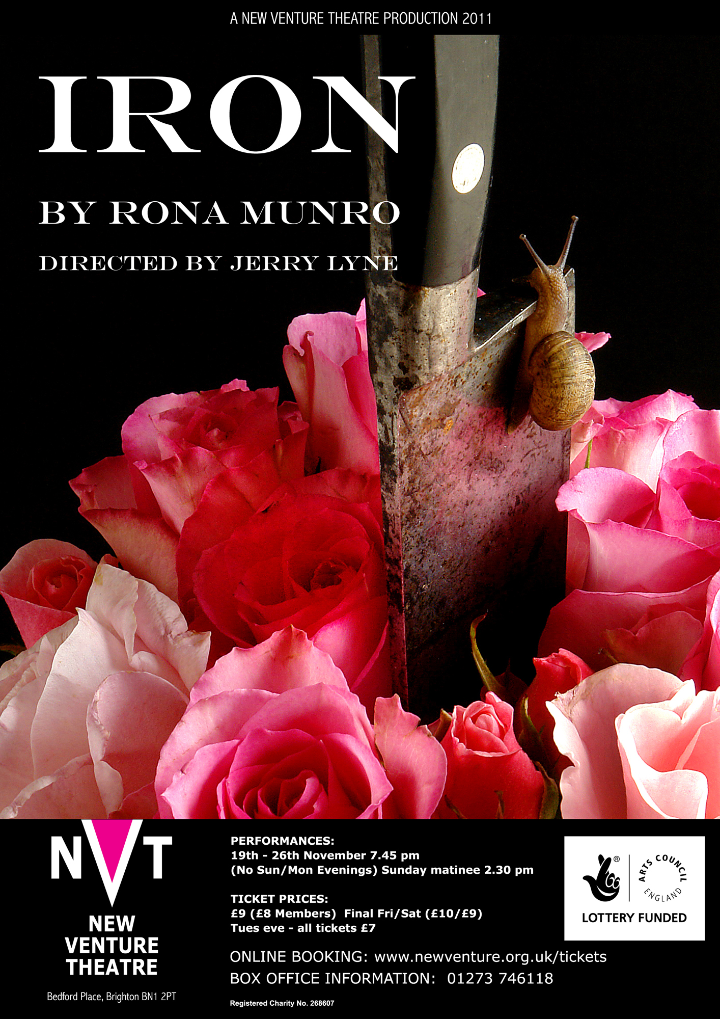
A lot of violence in the back-story of ‘Iron’ as well. It’s about a woman who seemingly has murdered her husband, and spent years in jail as a result. But there are deeper layers to the story, and she’s probably protecting her daughter. You can read my critique of the play on the Analyses page of my writing site. I wanted to produce a graphic portrayal of a domestic killing. The snail really did slither up the blade – it’s not been Photoshopped in . . .
*
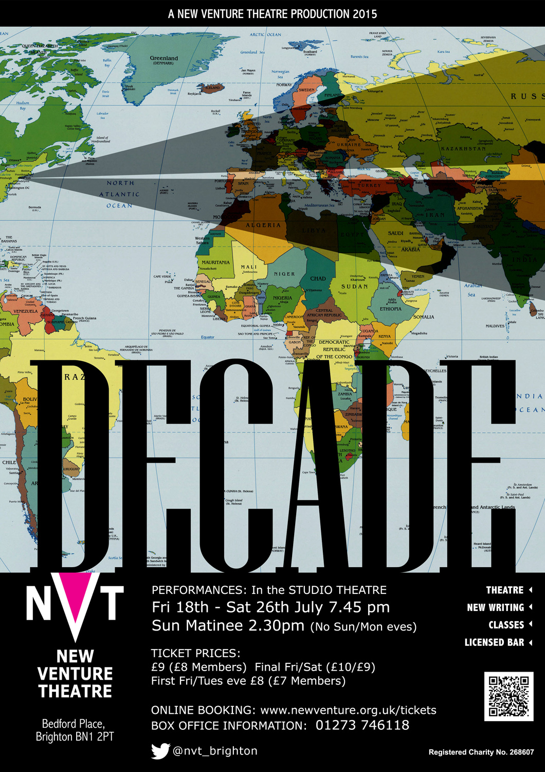
A lot of symbolism in this one, too. ‘Decade’ is a set of a dozen or so short plays looking back at September 11, 2001. I wanted to give an idea of the Twin Towers, and how the ever-lengthening shadow of their destruction has fallen over Europe and the Middle East.. The director finally went for a conventional New York panorama – but here’s the poster anyway, in its NVT format.
*

I’ve used a photograph for this poster for ‘The Homecoming’, Harold Pinter’s play about disfunctional family relationships. Teddy brings his wife back from America to meet his family – a family riven with several generations of sibling rivalry. I wanted to portray the idea that the couple are just about to enter a place that’s very dark and threatening indeed. It’s really wife Ruth’s homecoming, though, so only she casts a shadow … The names of author and director would normally be centred in this kind of layout, but I put them at bottom left, with the viewer’s gaze led there by Ruth’s shadow – so that (hopefully) I produce a slight jarring sensation in the viewer, preparing them for the disturbing scenes in store.
*

Another poster in black and white; another Shakespeare – ‘Hamlet’ this time. I’m constantly trying to push the boundaries of layout, and I wanted the image to pull viewers into the poster and direct them towards the text at the upper right. This was a cut-down version of ‘Hamlet’, adapted by Steven O’Shea, – with just the two families, and everybody seems to be watching or spying on each other. The eyes could be the Ghost of Hamlet’s father, or they could be Polonius, watching from behind the arras, or Claudius racked by his guilt – or they could be Hamlet himself.
*

Ah! The Scottish Play. Another cut-down version directed by Steven O’Shea. Just the Macbeths, Banquo, and the Witches. Dark, and very moody.
*
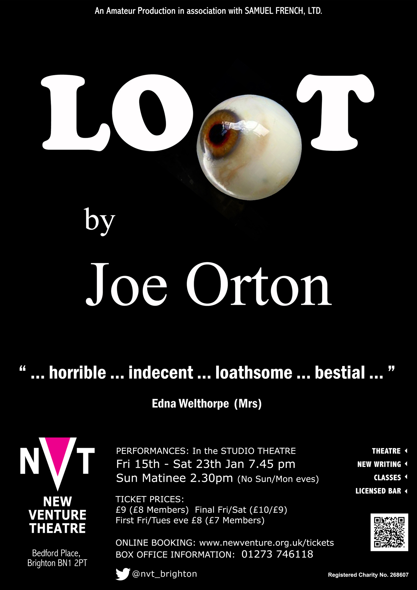
I’ve done a lot of posters for Steven O’Shea’s productions, like the one above, for example, but my favourite is probably ‘Loot’. I love all of Orton’s work, and I first saw ‘Loot’ performed many years ago, with Leonard Rossiter as Inspector Truscott. That was just a week before the great actor died – in his dressing room at the theatre, playing ‘Loot’. Some posters work best with a very simple image. Joe Orton’s masterpiece concerns two young criminals who have recently robbed a bank. Hal’s mother has just died, and the boys hide the loot in her coffin. This, however, leaves no room for the body … The police arrive, and at one point Hal’s mother’s glass eye drops out of the coffin and rolls across the floor – did I mention that Loot is a comedy? Irresistible choice of imagery for the poster, then. Like the first poster on this page (The Ugly One), I enjoy making use of the graphic potential of objects. Orton was an anarchic joker, and he used to write hysterically abusive letters to the newspapers, condemning his own plays. They purported to be written by a Mary Whitehouse prototype called Edna Welthorpe (Mrs), and the poster quotes are hers.
*

Another woman in this one. Edward Albee’s ‘Three Tall Women’ is actually the story of one tall woman, told to us by the woman herself, at three stages of her life. I photographed the three actresses who play the woman at twenty, forty and eighty years old, as silhouettes against a white background. Then cut them out and arranged them to give a sense of the layering of experience that Albee’s play does so elegantly. Tried to keep that sense of elegance in the typeface, too.
*

Here’s ‘Of Mice and Men’. I hadn’t realised until we did the production that Steinbeck himself had re-written the book as a play. I won ‘Best Lighting Design’ at the Brighton and Hove Arts Council Drama Awards in 2010 for the lighting on this one. The director wanted to show the river that George and Lennie reach in their travels, and that Lennie eventually dies next to. I put ripples in (or rather, Tamsin chucked pebbles into the water) to give a sense of the consequences of events spreading out from their point of origin. You’ll recognise the Marlboro typeface for the title, of course …
*
*
*
